Hi there!
So, in order to showcase a strong portfolio with Webflow or Framer I would like to demonstrate how I translate design from Figma into Framer (for now).
First, I look for a Figma design with minimal resources because I want to demonstrate how I can improvise with limited assets.
 Here, we've found our 'target,' so let's begin translating it. Don't forget to ask for permission and give proper credit.

This design is created by Hero Ninja called Trafalgar Landing Page
After we find the design, in this case lets say I got design from my project manager,
I will review its composition. If I feel confident that I understand the design, I will move on to the next step: transferring the design to Framer.

When we paste the design to Framer, it obviously still messy,

In order to create a well-structured Framer layout with easy access to responsive designs for each breakpoint,
we need to separate each part or group into a stack. This tool allows you to arrange elements either horizontally or vertically with equal spacing.
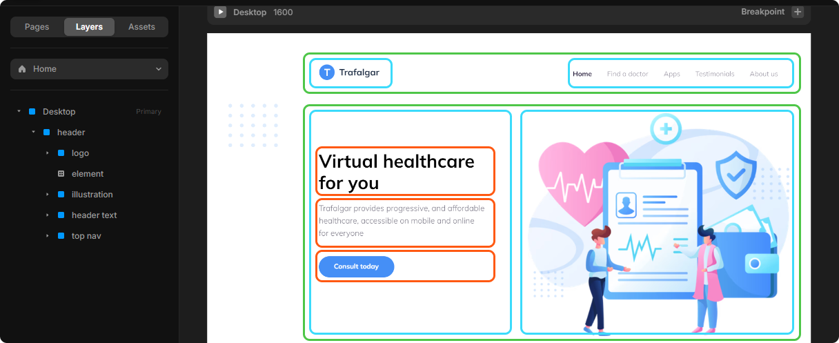
Here is the result after separating each part into stacks.

By using stacks, we can easily create responsive breakpoint views.

That's it!
Long story short, here is the final result.
No-Code using Framer
Click here for result!
Click here for source!
Code using Vite and Typescript with TailwindCSS
Click here for result!
Click here for source! (Update are Underway)
Thank you for scrolling (and hopefully reading my blog as well)! Check out my other works 😁
"hear, hear!".